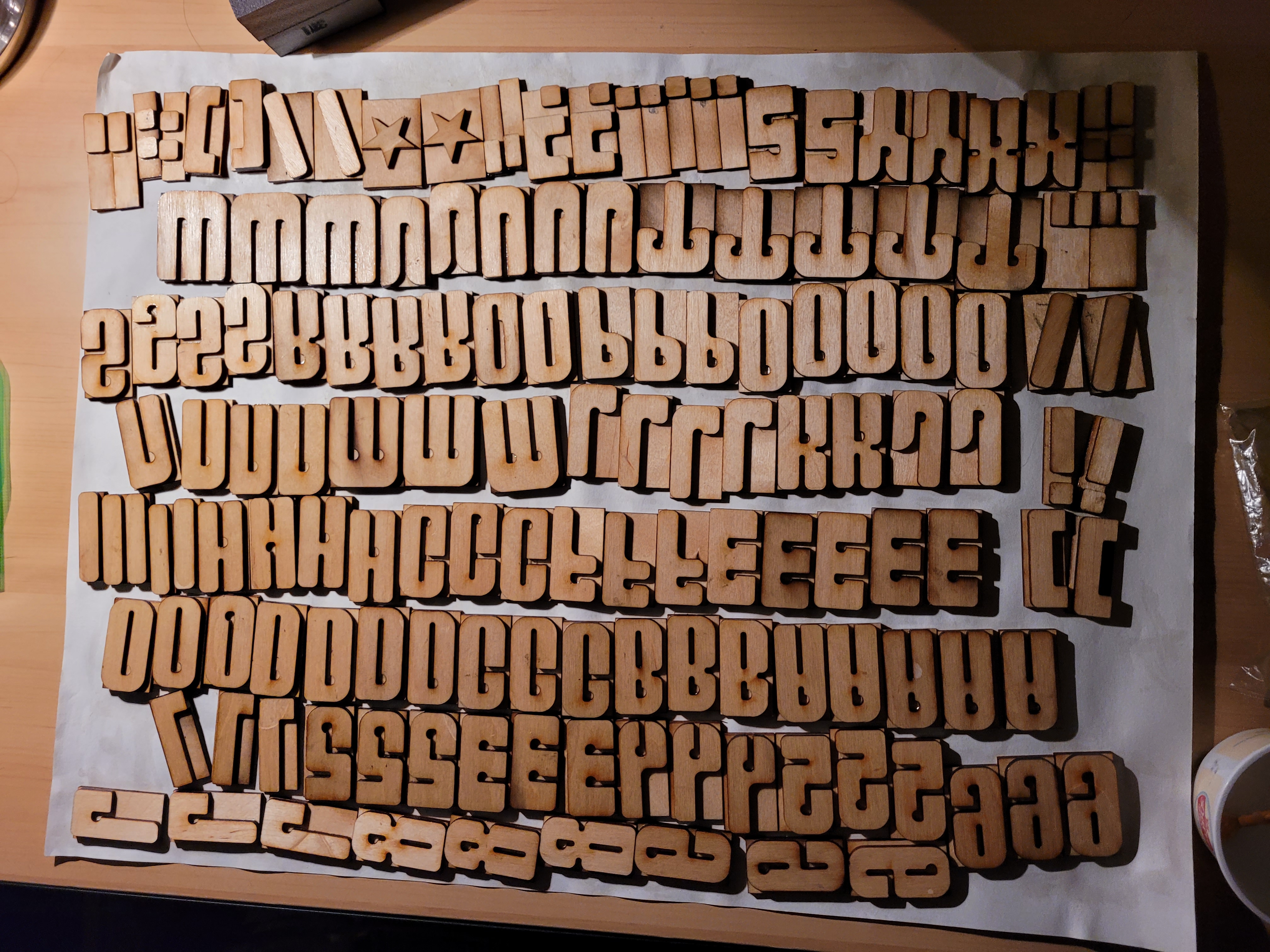

The font was defined by two main characteristics. First, Anway wanted to create a typeface that was blocky in nature with thick stems and blunt edges. This was informed by his experiences as a musician in a punk rock band, calling back to socialist propaganda. The second defining factor of the typeface was to have an elevated midline, thus increasing the x-height of the font. Having the midline raised above the midpoint is meant to inspire the sense of three point perspective, the idea that the bounding lines of a tall building would taper towards each other as you look up to the top. This was done instead of giving the letters themselves a taper due to the resulting emptiness towards the cap-height of the letter detracting from the aforementioned stocky design.


The mid line of the typeface is raised at a 2:3 ratio, mirroring the ratio of the height by width, moving the weight of the letters further towards the top. The second big implementation is the asymmetrical internal serif cutout, what looks like stylized "P"'s are utilized in every letter. This was done for two reasons, for an accent that ties together the typeface continuing the theme of asymmetry as well as a substitute for the traditional serif. Due to the stocky almost brutalist nature of the typeface there wasn't room for a traditional serif, thus we adopted the internal cut out instead to take its place.
![]()
![]()